Hello Hello! I've got another Photo Fiasco for you today...only this one ends with a tutorial!
While I know Christmas isn't until next month and that here in the states we have Thanksgiving still this month...today's post has a Christmas theme to it. Why? Because now is the time to finalize your photos for Christmas cards!
So after this we'll leave most of our Christmas posts until later so we don't get yelled at by this turkey:
 |
| Bahahahaha, I laughed at this so hard the first time I saw it last year. |
So...do you have your pictures all ready and set for your cards? Me neither. Slacker, I know. Maybe I'll just draw in stick figures this year. Sounds like a good plan to me. Cyndi is more on the ball than I am and is working on Christmas style pictures...only she ended up sending us one.
The Original Pin
| http://www.lizvetteblog.com/diy-easy-christmas-lights-background-photography/ |
Cyndi used this as her inspiration, got the set up put together, snapped the shot, then sent it to us.
The Pinstrosity
"I'm pretty sure I nailed it! ;)" Cyndi told us.
That's still pretty cute. And Cyndi really did almost have it...just a few tweaks and it'd be about what she wanted. It's hard to recreate photos from professional photographers who have had practice and who know their cameras in and out...but there are a few things that the non-professionals of us can do to get results that look more like the original.
I actually tried this out last year for a friend using the same photo (the one from the original pin) as my inspiration), and I learned a few things. I didn't have the net lights though, I only had swag lights so that is what we used. I've learned a lot since this time last year and I'd love to try this out again and see if I can get better results.
 |
| http://marquettephoto.blogspot.com/2011/12/katies-first-christmas.html |
The main thing I learned (and didn't accomplish incredibly well in my photo...but I started to get it) is that a key to making this work is depth of field.
Depth of field is the portion of the photo that is in sharp focus. Let me give you a visual example.
| http://www.dofmaster.com/dof_defined.html |
The photo of the dominoes has a shallow depth of field, resulting in only the middle dominoes being in focus and the others in front and behind are out of focus.
A camera on general auto mode will usually try and get as much of the photo in focus as it can...which is not quite what you want in this photo. You need to be able to have the background blurred so that you can't see the wires as much. Instead of shooting on general auto mode, try switching your camera to macro mode (it is usually the flower symbol on many cameras). If you know how to change the aperture of your camera, do a low f-stop.
Don't know how to change the f-stop or you still can't get the depth of field shallow enough? I'll show you how you can change a "normal" photo into getting a similar depth of field look using a photo editing program. I use GIMP (a free editing program) and will be giving these instructions in Gimp terms, but this can of course be done on Photoshop as well.
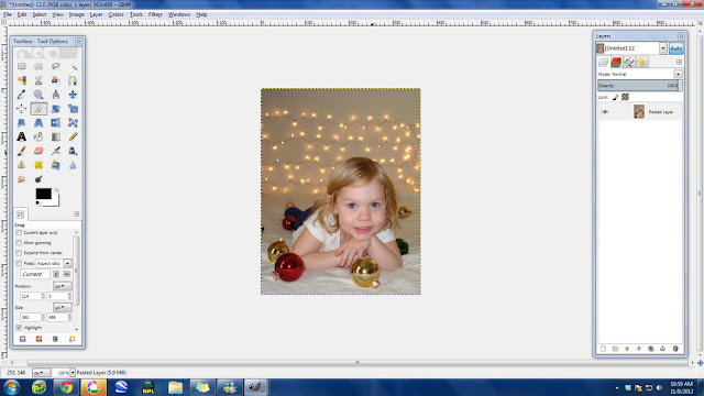
1. Open your photo (I know...that step's given, but oh well). If you want to see any of these tutorial photos larger, just double click on them here in the blog post.
2. I went ahead and cropped the photo down to bring the eye's focus directly into the picture. This helps to make the adorable girl more of the visual focus of the photo.
See? That looks a little better already.
3. I decided to lighten up the photo a little bit. I use the curves tool under the the Colors tab in the menu to change the lighting, but the levels tool works well too.
Just a little light helps. You can change the color in the curves box if you want too. I took some of the red out and added a little blue to try and balance the colors.
You can also balance colors using the "Color Balance" tool under the Colors menu button.
4. Now you need to add a new layer. Gimp makes this easy. In your layers box (the box on the right), click and drag your layer down to the multiply button. You can see my holding the layer over the multiply button there in the bottom right corner in the photo below.
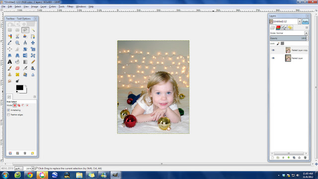
5. Now that you have two layers (see them both there in the layers box?), we need to cut one up a little bit. Make sure the top layer is selected (see how the top layer is highlighted in blue in the Layers Box, that shows I've got the top layer selected). Then, in your toolbox on the left select the lasso button.
6. I then drew around the girls head and the close ornaments. You can click and hold and draw one continuous curvy line if you have a steady hand with the mouse. If not, just draw a series of small lines and that works great (I do that often).
7. Once I drew all the way around the girls head and arms and the ornaments I clicked the point where I started drawing and it closed the selection, giving a black and white dotted line around my selection.
8. I hit delete to take out the section that I just created. You can better see the hole that you just created if you hide the bottom layer. To hide layers click the eye button next to the layer in the Layers Box.
9. Making sure that you've selected the top layer, click the Filters button on the top menu bar, then select Blur, then Gaussian Blur.
I set mine to blur at 9 pixels...but the amount of blur you'll need will vary with the size of your photo. I was working on a small photo, so I didn't need a large blur radius. Luckily the Gaussian Blur box that pops up gives you a preview of what the blur will look like so you can change the settings to get the right amount of blur for you. Hit ok when your settings are to your liking.
And your top layer is now blurred!
10. Now un-hide the bottom layer (just click the eye button again) and you can see your non-blurred bottom layer through the hole you made in the top layer. We're not quite done yet though. There is a blurry halo around the girl and the close ornaments that I wanted to get rid of.
11. I selected the eraser button in the left Toolbox.
12. I re-hid the bottom layer and selected the top layer. Before I started erasing, I made sure that the opacity on my eraser was reduced (I ended up using it at 38.3% strength), and I used the fuzzy circle brush.
Erase the edges of the head, and then a horizontal swath of the photo. Look below to see what I did. You're trying to mimic the shallow depth of field look here, so you're erasing some of the blurred section to create a crisp "in focus" section.
13. Unhide the bottom layer and there you've got your faux shallow depth of field photo.
And just for comparison, here's the before and after:
So play around with your camera, play around with your editing programs and see what you can come up with. Depth of Field is really fun to play with, and it is so exciting once you start figuring out how to make it happen on purpose. I remember the first time I got it purely by accident and I was so excited. I had no idea how I did it at the time, but it was fun any way. Figuring out depth of field opens up all sorts of fun ideas and projects and it can make your pictures really pop. Give it a try and see what you can come up with!


.jpg)

.jpg)

.jpg)


-001.jpg)


0 comments:
Post a Comment